Flushing, city with character
Flushing, city with character
A city shows itself in what it says, how it sounds and how it looks. In people, images, stories and style. The city logo is a fixed factor in this: a recognizable sender of what is shared in, by and on behalf of the city. On this page you can read why we choose to have our own city logo - and how that fits in with Vlissingen's identity.
Vlissingen is a city with character - and it shows in how we present it. On this website, we use the city logo VLISSINGEN: powerful, clear and without additions. No slogans, no frills. Just: Flushing.
We do that on purpose. Because this website is part of Citymarketing Vlissingen, intended for everyone who lives, works, studies, undertakes or visits Vlissingen. We tell the story of Vlissingen as it really is: unpolished, maritime, colorful and on the move.
About the logo
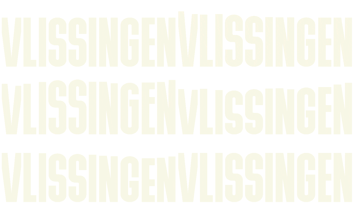
The city logo consists of one powerful word: FLISSINGEN. In capital letters, designed in the typeface Bulevard - a deliberate nod to the boulevard so characteristic of the city. The typeface is robust, open and instantly recognizable! 'VLISSINGEN'.
What makes the logo unique is that it is moves with the tides of the Western Scheldt. Through a real-time link to actual water levels, the shape subtly changes with ebb and flow. That movement is a direct translation of the maritime DNA of Vlissingen. A city that lives with the water, changes with the flow, but always remains true to its character.
As such, the logo is not a fixed image, but An identity that moves - just as Flushing does.
Why not the municipal logo?
For city marketing, we use not the municipal logo, because city marketing plays a different role than the municipality's formal government communications. Namely, there is a difference between:
- The Municipality of Flushing - the organization that makes policy, implements it and supports residents.
- The city of Flushing - the place where people live, work (including business and investment), study and recreate.
These two worlds require their own appearance. The city logo belongs on letters, permits and policies. The city logo belongs on the stories, events and initiatives that make the city come alive.
One face outward
The city logo VLISSINGEN is used for campaigns, partnerships and promotion. This creates one recognizable sender in everything we say about the city - from cultural activities to impactful (delta) innovation.
Flushing is multifaceted, but always itself. And that is exactly what we want to show.
Creation
The design of the city logo came about in collaboration with several parties: the Citymarketing Vlissingen steering committee, the VLOC, cultural institutions, the partners of the Knowledge Yard and internal stakeholders of the municipality. The logo is consistent with Vlissingen's DNA, the city's strategic vision and economic positioning as a hotspot for delta innovation.
